Email newsletters are a cornerstone of digital marketing, but creating one that stands out can be challenging. This article compiles examples, design tips, and best practices to help you create the best newsletter designs and effectively communicate with your audience. Whether you’re drafting your first newsletter or looking to improve your current email design, this guide will inspire you with engaging newsletter design ideas and practical advice.
Table of Contents
Why is newsletter design important?
Newsletter design is an essential aspect of email marketing. It not only gives your business a professional look but also determines how your message is perceived by your audience. An effective newsletter design resonates best with your audience and helps you build strong relationships with them.
What are the best practices for email newsletter design?
When it comes to designing a newsletter, there are some best practices you should follow:
- Keep your design simple and clean – a minimalist design can make your message more understandable.
- Ensure your newsletter is responsive – it should look good on all devices.
- Use attractive headlines – the title of the newsletter should be catchy and engaging.
- Include a clear call to action – guide your readers on what you want them to do next.
How to choose the perfect email newsletter template?
Choosing the right email newsletter template is crucial for your email marketing strategy. The best email templates should align with your brand and fit the type of email you’re sending. You can choose from pre-made templates or customize one from scratch.
Here are some detailed steps to help you choose the perfect email newsletter template for your campaign:
Align with Your Brand Identity
The design of your email newsletter should reflect your brand’s visual identity. In the same way that you design computer mockups before completing the final design, maybe you can treat newsletter designs in the same manner. This includes color schemes, typography, logo placement, and overall style. Consistency in design helps increase brand recognition and gives a professional touch to your newsletters.
Consider Your Content
Different newsletters serve different purposes, such as promotional materials, updates, or informational content. The template you select should accommodate your specific type of content. For example, if you’re sharing a lot of news updates, a multi-column layout may be beneficial. In contrast, for promotional emails, a single-column design that highlights a few key elements can be more effective.
Responsiveness is Key
As people use various devices to check their emails, it’s important that your newsletter looks good on all screens, from desktops to smartphones. Thus, opt for responsive email newsletter templates that automatically adjust to the screen size of the device on which they’re viewed.
Easy to Read and Navigate
Your newsletter should be easy to read and navigate. A clean layout with clearly defined sections can help guide your audience through the content. Bullet points, headers, and dividers can be used to break up text and make information digestible.
Customization Options
Even if you’re using a pre-made template, you’ll want to customize it to fit your unique needs. Look for templates that allow you to easily change colors, fonts, images, and add elements like buttons or links.
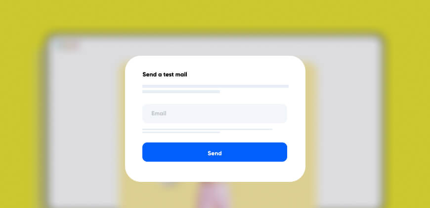
Test Your Template
Before sending out your newsletter, send a test email to yourself and some colleagues. This allows you to see how it looks in different email clients and make any necessary adjustments before it reaches your audience.
Remember, the perfect email newsletter template is not just about aesthetics; it should complement your content, resonate with your audience, and align with your brand identity.
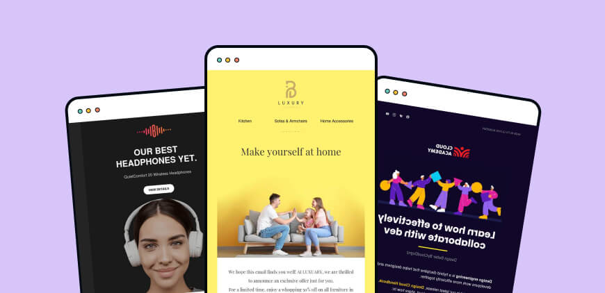
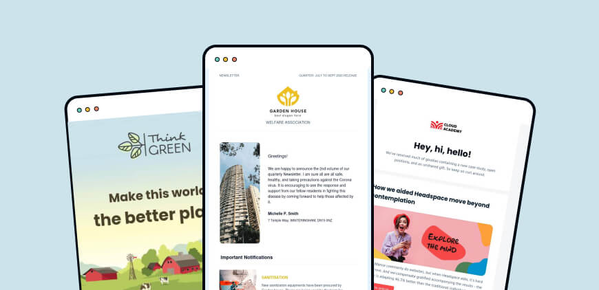
What are some effective newsletter design examples?
There are many great examples of effective newsletter designs that can inspire you:
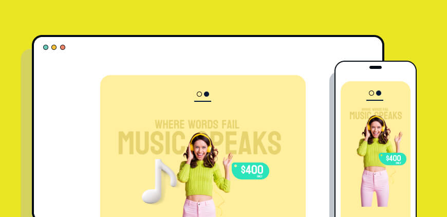
- Newsletter Example 1: This business email uses beautiful colors and visuals in their newsletter.
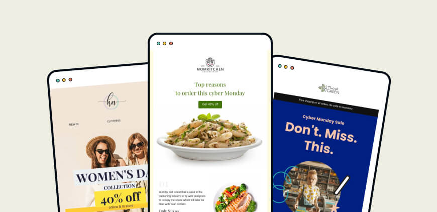
- Newsletter Example 2: This professional newsletter uses a simple layout to make its content easily digestible.
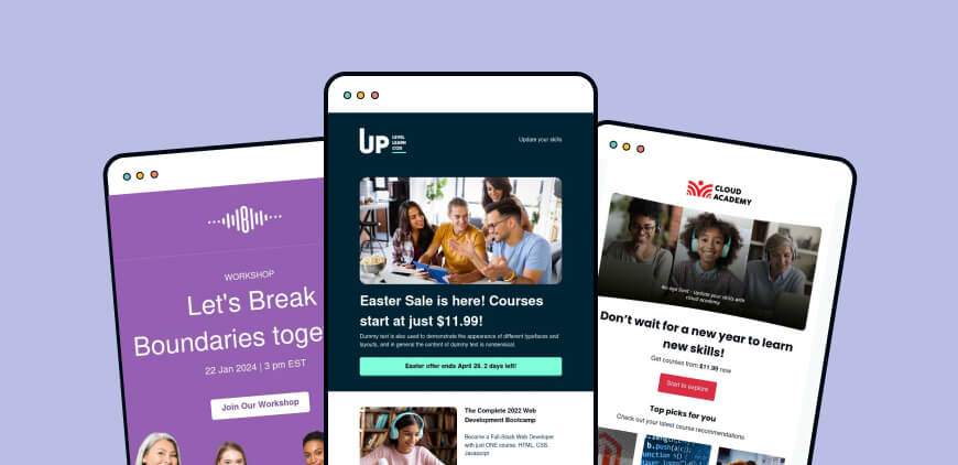
- Newsletter Example 3: This monthly newsletter highlights important information at the top of the email.
Newsletter design best practices
Here are some design tips to enhance your email newsletters:
- Use high-quality images – they add value to your content.
- Use consistent typography – it helps maintain a professional look.
- Use white space wisely – it improves readability.
- Keep your email body concise – long emails can lose reader interest.
How to make your email stand out with professional newsletter design?
To make your email stand out, ensure that your newsletter has a unique and recognizable design. This includes using consistent colors, having a well-designed newsletter header, and including engaging content in the email body.
Here are some detailed strategies to help your email stand out:
Consistency is Key
Maintain consistency in your newsletter design. Use the same color schemes, fonts, and layout styles as your brand. This not only enhances brand recognition but also gives your newsletter a professional look.
Eye-Catching Subject Line
Your email’s subject line is the first thing recipients see. Make it catchy and relevant to encourage recipients to open your email. Experiment with questions, personalization, emojis, or powerful action words.
Use High-Quality Visuals
Incorporating relevant, high-quality images or graphics can make your newsletter more engaging and visually appealing. They can also help break up text and make your content more digestible.
Personalize Your Content
Personalization can significantly increase engagement rates. Whether it’s using the recipient’s name in the greeting or tailoring content to their preferences, personalized emails often feel more relevant and attract more attention.
Responsive Design
With many people checking emails on their mobile devices, having a responsive design is crucial. Ensure your newsletter looks good and functions well on all screen sizes.
Clear Call-to-Action (CTA)
Guide your readers on what to do next with clear and compelling CTAs. These should stand out in your design and lead readers to take desired actions such as visiting your website, purchasing a product, or reading a blog post.
Keep it Clean and Uncluttered
A clean, minimalist design can help your key message stand out. Too many elements can confuse readers and detract from your main message. Balance your text with white space to make your email easy on the eyes.
Test and Analyze
Lastly, always test your emails before sending them out to see how they appear in different email clients and devices. Analyze your email campaigns to understand what works best for your audience.
By using these strategies, you can create professional newsletter designs that not only stand out in the inbox but also effectively convey your message and resonate with your audience.
What are some effective design elements for a beautiful email?
Effective design elements for a beautiful email include visually appealing colors, easy-to-read fonts, high-quality images, and interactive elements like buttons or links. A well-designed email should also be responsive to ensure it looks good on different email clients.
How to create an engaging monthly newsletter?
Creating an engaging monthly newsletter involves regular communication with your audience, providing valuable content, and using a consistent and appealing design. Make sure to include in your newsletter relevant information that your audience finds valuable and wants to read.
What are the latest newsletter design trends?
The latest newsletter design trends include using bold colors, integrating interactive elements, and incorporating minimalist design principles. These trends aim to create a more engaging and enjoyable reading experience for your audience.
How to create an effective email newsletter from scratch?
Creating an effective email newsletter from scratch involves several steps:
- Define your audience: Know who you’re writing for.
- Decide on the content: What information will be most valuable to your audience?
- Choose a design: Use a responsive design that looks good on all devices.
- Test your email: Make sure it displays correctly on different devices and email clients.
Key Takeaways:
- Effective newsletter design is crucial to engage your audience.
- Best practices for newsletter design include simplicity, responsiveness, attractive headlines, and clear calls to action.
- The right email newsletter template can greatly enhance your email marketing efforts.
- There are many great examples of newsletter designs to inspire your own creations.
- Making your email stand out requires a unique and recognizable design.
- Effective design elements for beautiful emails include appealing colors, readable fonts, high-quality images, and interactive components.
- Creating an engaging monthly newsletter requires regular communication, valuable content, and consistent design.
- Stay up-to-date with the latest newsletter design trends to keep your emails fresh and engaging.
- Creating an effective email newsletter from scratch involves knowing your audience, deciding on the content, choosing and testing your design.
Burkhard Berger is the founder of Novum™. You can follow him on his journey from 0 to 100,000 monthly visitors on novumhq.com. His articles include some of the best growth hacking strategies and digital scaling tactics that he has learned from his own successes and failures.