
An email signature is the small block of information at the end of your emails—usually your name, job title, company, and contact details. Think of it as your digital business card. When designed well, it makes your emails look organized, trustworthy, and professional.
Why does email signature size matter? If your signature is too big or full of bulky images, it can clutter up your messages, slow down loading, and sometimes even trigger spam filters. On the other hand, if it’s too small, people might miss important details.
So, what’s the ideal email signature size? Aim for about 600–700 pixels wide and 150–200 pixels high. This fits nicely on both desktop and mobile screens, keeps your signature looking sharp, and ensures all your important info is easy to find—without distracting from your message.
Table of Contents
Understanding the Anatomy of a Signature
Before diving deeper into sizing, it is important to recognize that a signature is composed of several distinct elements. Each component requires its own consideration to create a harmonious and effective whole.
- Text: Your name, title, company, and contact information form the core of the signature.
- Images: This typically includes a company logo or a professional headshot.
- Links: Hyperlinks to your website, social media profiles, or a specific call-to-action (CTA).
- Banners: Optional promotional graphics used for marketing announcements or events.
The key to a great signature is not just sizing the container, but sizing each of these elements in relation to one another to create a clear visual hierarchy. Proper spacing plays a crucial role in how your email signature appears across devices. From avoiding awkward line breaks to maintaining clean alignment, even small formatting codes like non-breaking spaces ( ) can impact how your email signature renders.
Best Practices for Sizing Signature Components
Achieving the ideal overall dimensions requires careful attention to the individual parts of your signature.
Text Elements: Name, Title, and Contact Details
Readability is the top priority for text. Use simple, web-safe fonts like Arial, Helvetica, Verdana, or Times New Roman to ensure consistent rendering across all email clients. For font size, a good hierarchy is:
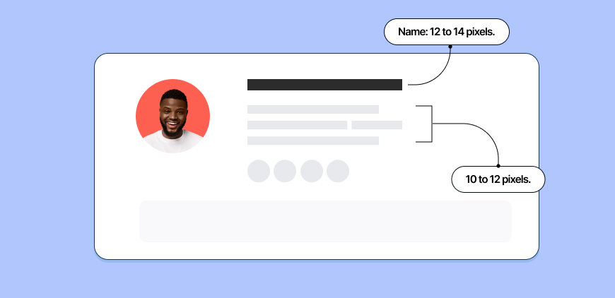
- Name: 12 to 14 pixels.
- Title, Company, and Contact Info: 10 to 12 pixels.
This structure makes your name the most prominent element while keeping supporting details clear and legible without appearing bulky. Ample spacing between lines is also critical to avoid a cramped look. Avoid using non-standard fonts that might not render well. Stick to email-safe fonts that look professional and load reliably across email clients.
Logos and Profile Photos
Images are often the biggest culprits in oversized signatures. A logo or headshot should be a subtle branding element, not a dominant fixture.
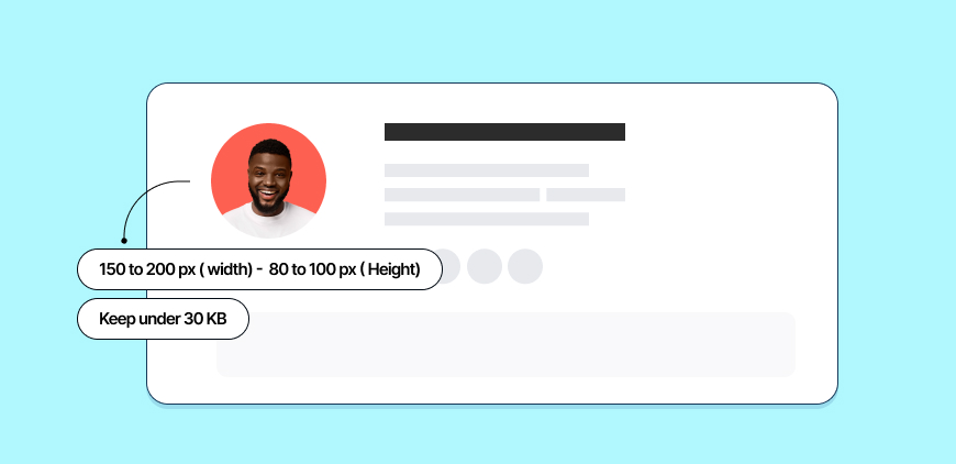
- Recommended Dimensions: Aim for a maximum width of 150 to 200 pixels and a height of 80 to 100 pixels.
- Resolution: Save your image at double the intended display size (e.g., save a 300px wide image to be displayed at 150px) and then constrain it with code. This ensures it looks sharp on high-resolution “Retina” displays.
- File Size: Keep the image file under 30 KB. Use image compression tools to reduce file size without sacrificing too much quality.
Social Media Icons
Social icons should be recognizable but discreet. They are a secondary call to action.
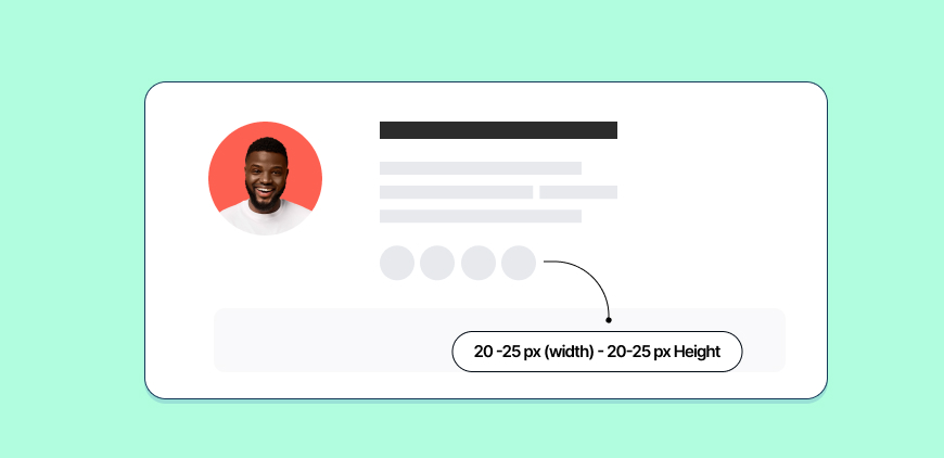
- Recommended Dimensions: 20 to 25 pixels wide and high is standard.
- Consistency: Ensure all icons are the same size and style to maintain a clean, organized appearance. Using a pre-made icon set is often the easiest way to achieve this.
Promotional Banners
Banners are powerful marketing tools but must be used with care. An oversized banner can feel intrusive and unprofessional. If you choose to use one, it should follow the overall width limit of your signature.
- Recommended Dimensions: A banner should not exceed the signature width of 600-700 pixels. The height should be kept minimal, typically under 100 pixels, to avoid pushing email content too far down.
- Usage: Reserve banners for significant announcements, like a webinar, major event, or new product launch. Avoid using them in every email, as this can lead to banner blindness and dilute their impact.
Designing for a Mobile-First World
Over half of all emails are now opened on mobile devices. This statistic single-handedly dictates modern email signature design. A signature that is not mobile-friendly is a signature that fails half its audience.
The 600-pixel width recommendation is specifically chosen for its mobile compatibility. Most mobile email clients will automatically scale down wider content to fit the screen, but this can lead to tiny, unreadable text and unclickable links. By designing within that constraint from the start, you ensure a much more predictable and user-friendly result. Simple, single-column layouts are far more effective on mobile than multi-column designs, which can break or stack awkwardly. Always test your signature by sending emails to your own mobile device to see how it renders on a smaller screen.
Common Mistakes to Avoid
Many well-intentioned signatures fall flat due to common sizing and design errors.
- Using a Single, Large Image: Never create your entire signature as one image file. It is terrible for accessibility (screen readers cannot read it), prevents users from copying your contact details, and is a major spam filter trigger.
- Ignoring File Size: Large, uncompressed images are the primary cause of slow-loading emails. This is especially problematic for recipients on slow mobile networks.
- Relying on Exotic Fonts: Using a custom brand font may seem like a good idea, but if the recipient does not have that font installed, their email client will substitute it with a default, often breaking your layout. Stick to web-safe fonts.
- Too Much Information: A signature is not a resume. Include only the most essential contact details. Piling on multiple phone numbers, addresses, and a dozen social media links creates clutter and decision fatigue.
Conclusion: Simplicity and Consistency Are Key
Crafting the ideal email signature is an exercise in restraint. The goal is not to create a dazzling piece of art, but to design a functional, professional, and consistent branding tool. By adhering to recommended dimensions, optimizing for mobile devices, and prioritizing user experience over decoration, you create a signature that works seamlessly everywhere.
Think of your signature as the final, courteous closing to a professional conversation. It should be helpful but not loud, informative but not overwhelming. By embracing a mobile-first mindset and focusing on clarity, you can ensure your digital business card makes the right impression, every single time.
As a Marketing Director, I develop and implement marketing strategies, conduct market research, and manage a team of marketing professionals. With a successful track record of launching campaigns that drive revenue growth, I bring my marketing expertise to blog writing, creating engaging content that promotes the brand and its products/services.